Accessibility template
I created templates in Figma that demonstrated accessibility best practices for content designers. I focused on writing accessible headings, error messages and inclusive writing tips. The templates not only showed guidelines, but also provided context for how these design choices impacted users.
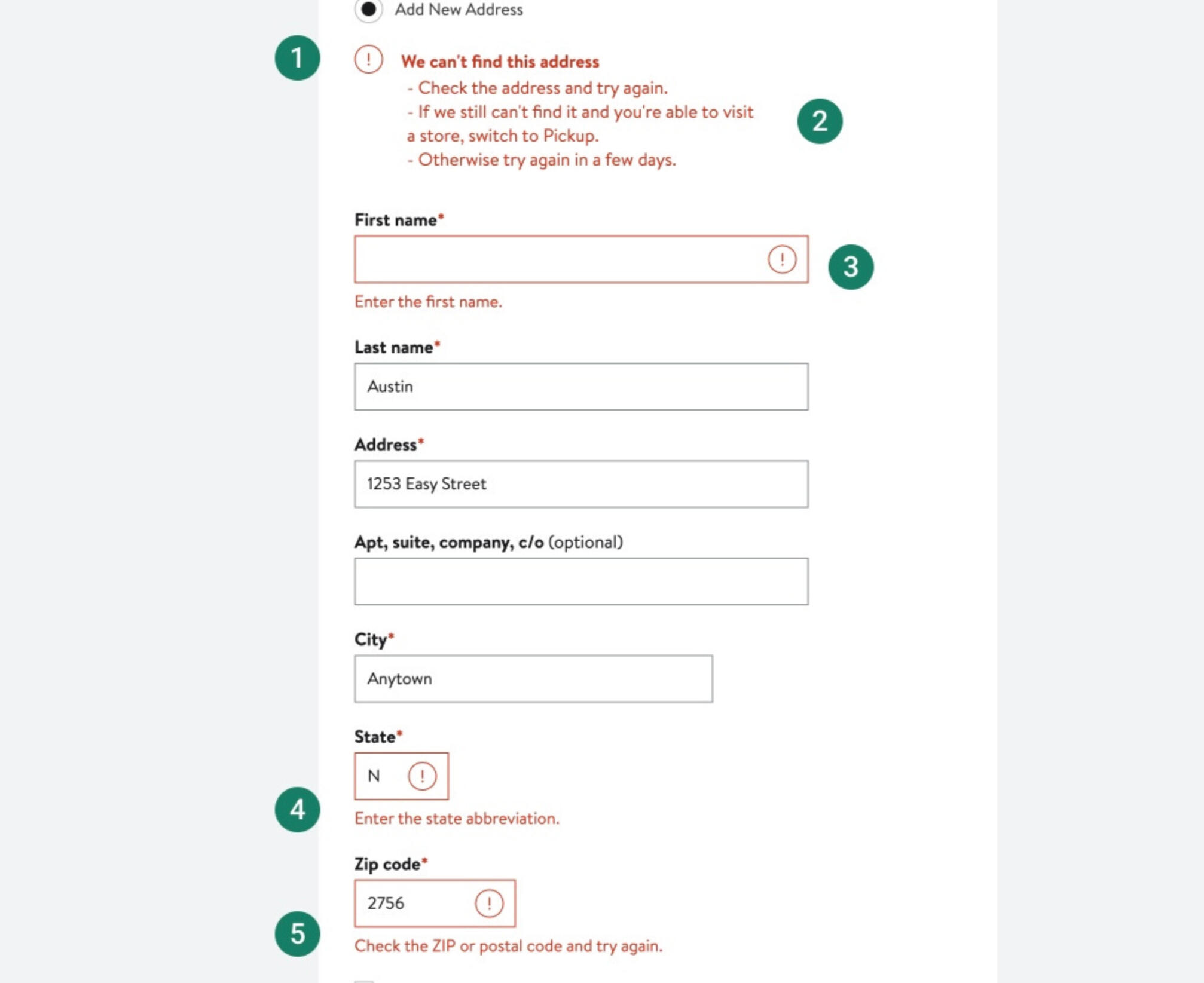
1. When formatting an error messages, include both an icon and a text message.
2. Error messages must be informative as well as helpful. Explain why the element failed and then offer a solution.
3. The error message must be in close probity to the element that failed. This way customers can quickly locate the error.
4. Use clear and simple language when writing error messages. Avoid including any technical jargon.
5. Avoid using all caps; except for acronyms. Using train case formatting can be harder to read.
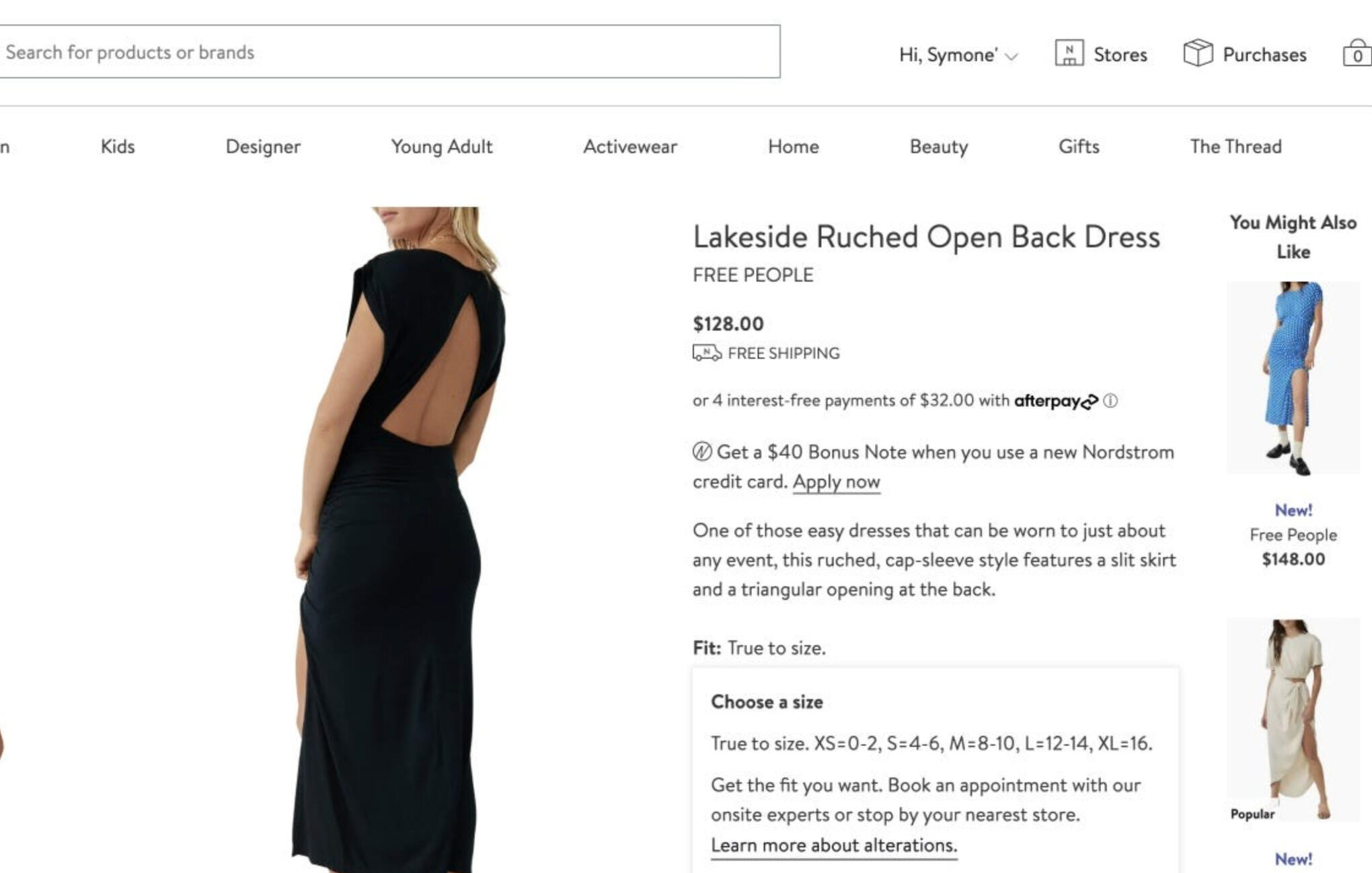
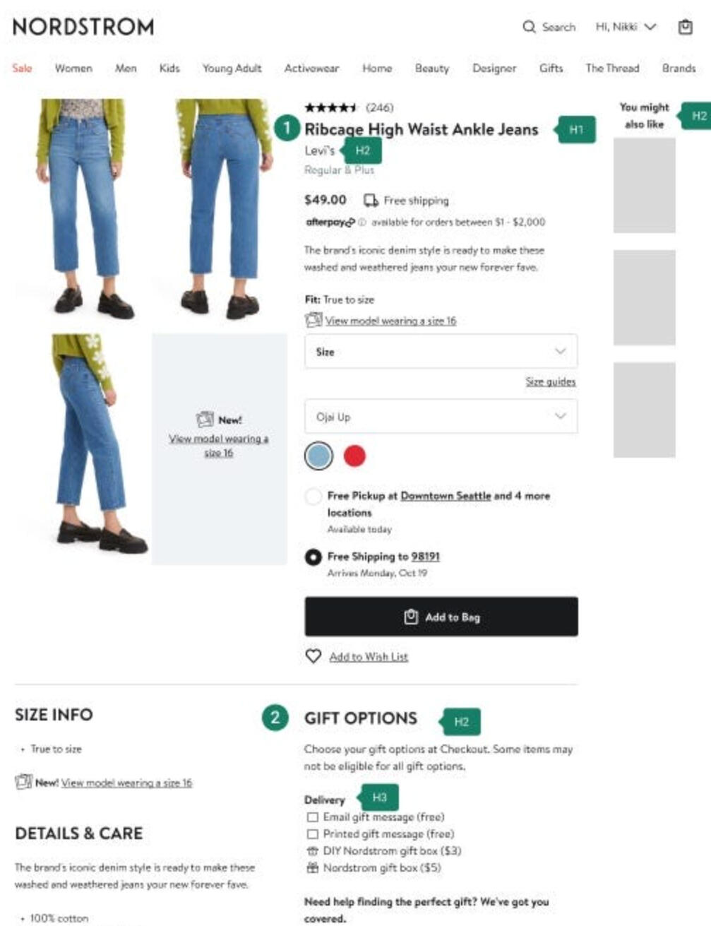
Inclusive languageWhen describing size information, use exact sizes. Saying we have a normal size range isn’t helpful, excludes audiences and presents a negative connotation to anyone outside of that “normal” label.In the photo below, all available sizes are included in the product description.
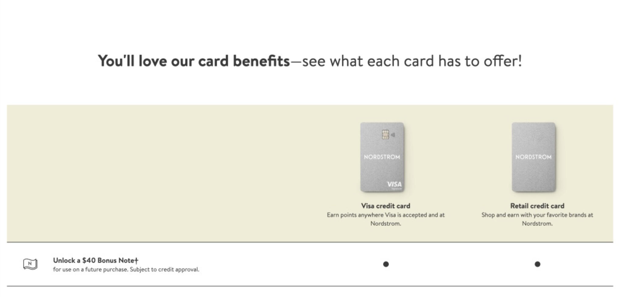
Ableist languageEveryone has different capabilities. Don’t assume to know someone’s physical abilities.Context is crucial. Words like see, click and look could be interpreted as ableist depending on the situation. Make sure words that describe physical capabilities don’t comment on a person’s condition in a way that diminishes them.Focus on the person and not their abilities.The heading in this example has the phrase “…see what each card has to offer!” An alternative could have been “…learn what each card has to offer!”
Gender-neutral languageUse gender-neutral language. Don’t use masculine or feminine pronouns. When showing possession, use theirs instead of hers or his. Writing in second person helps avoid gender-specific language.This email features an image with beauty products along with text regarding the products. The paragraph is written in second person. The image used in the email also gender-neutral by focusing on the products instead of showcasing a person using them.

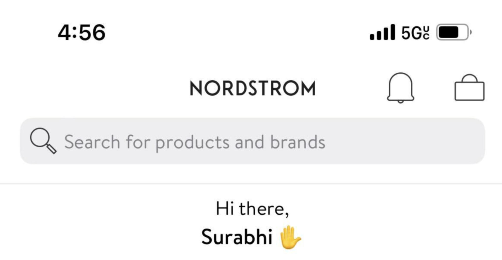
Emoji usageEmojis can sometimes have clear meaning. Other times they can be interpreted differently depending on the audience and situation.In this example, the yellow hand emoji is intended to be waving as in a greeting. But it could also be seen has a high-five or a salute.
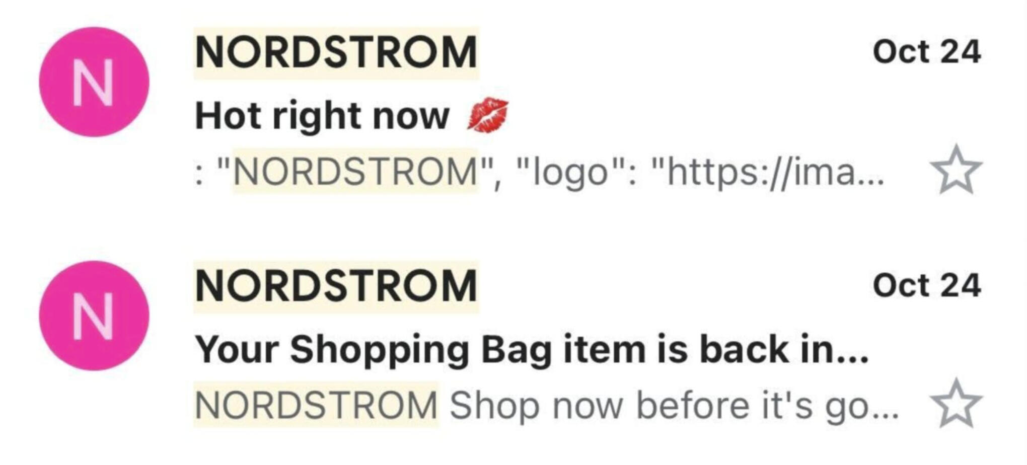
In this email example, the subject line is “Hot right now” followed by a kiss mark. A kiss mark could be taken in a sensual or sexual way. An alternative to the kiss mark emoji could be the fire emoji.
Accessible headings
There should only be one <h1> tag per page. For users who need assistive technologies, the <h1> tag is used for navigation and lets users find the main content of the page.Most pages won’t require more than 2 or 3 levels of hierarchy. Use <h2>, <h3> and <h4> as needed. <h5> and <h6> will rarely be needed and should only be used for very long or complex pages.
The hierarchy for heading tags is:
<h1>
<h2>
<h3>
<h4>
<h5>
<h6>
Screen readers read the headings in the order they’re presented on the screen. This is why it’s important to not skip ranks or levels. For example, don’t follow a <h2> with a <h4>. Or don’t follow a <h5> with a <h2>.Navigation and scanningHeadings are useful for both sighted and non-sighted users.Individuals who need a screen reader to navigate digital environments use headings to scan for information without having to read the entire page.Sighted users can use headings to scan for information without having to read the entire page.